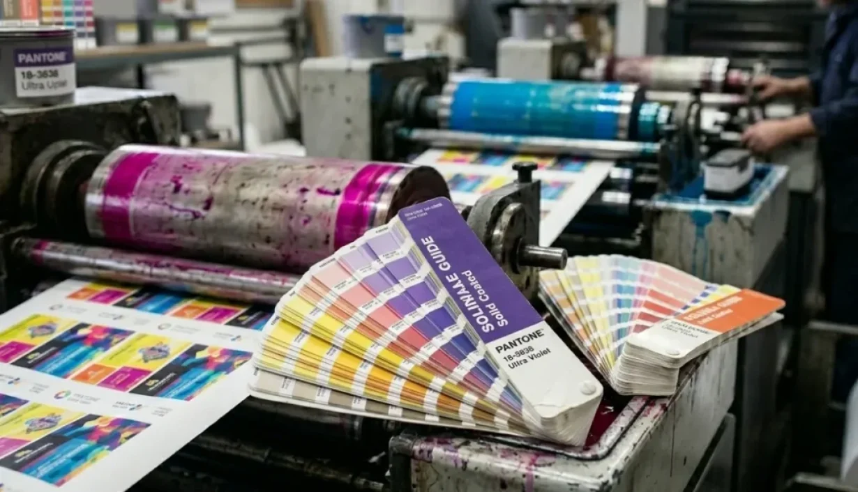

In card printing production, color inconsistency is a common issue during sample approval and mass production. A design that looks correct on screen often appears slightly different once printed on PVC, PET, or other card materials. This is a frequent challenge for brands that require strict color consistency across large-scale card programs. However, the reason behind this is not always obvious from a design perspective.
1. Why Card Colors Fail in Real Production
In design software, color is a perfect mathematical model. On a factory production line, color is a complex interplay of physics, chemistry, and material science.
The Illusion of Screen Colors (RGB vs. Print): Monitors display color via active RGB light emission, while cards reflect light through ink. Even the most expensive monitors cannot accurately predict how ink will behave through diffuse reflection on a PVC surface.
Pantone is not a Color; It’s a “Production Protocol”: Many mistake Pantone for just a color code. In a factory setting, it represents a standardized ink formula, calibration process, and acceptance criteria. It converts subjective feelings like “this blue looks a bit light” into engineering metrics like “ink formula deviation controlled within ΔE < 2.0.”
Material-Induced “Visual Drift”:
•Standard PVC: Has a fixed reflectance.
•PET / Wood / Paper: Different molecular structures result in entirely different ink absorption and refractive indices.
Lamination-Induced “Secondary Coloration”: This is a variable unique to the card industry. During production, RFID cards undergo high-temperature lamination at 180–200°C. The ink is sealed under a transparent protective film (Overlay). This “encapsulation effect” alters the light path, often making the final product appear slightly darker or more saturated than the initial print.
2. CMYK vs Spot Color in Manufacturing Reality
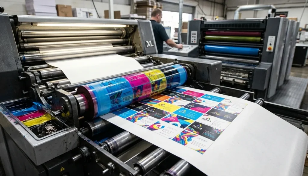
From a production standpoint, CMYK and spot color are not just two printing methods—they represent two completely different approaches to color control.
•CMYK = Variable System: Colors are created by overlapping four halftone dots. Minor adjustments in press pressure, ambient humidity, or dot gain will cause color drift. This explains why CMYK “looks fine” for small batches but becomes nearly impossible to control for large-scale or multi-batch production.
•Spot Color = Locking System: The ink is pre-mixed before it even touches the press. It is a flat application of a single ink, eliminating the variables of halftone dot overlapping. For brand primary colors, Spot Color is the only “risk lock.”
3. Why the Same Color Looks Different on Cards
In the manufacturing world, color is not a static property of ink; it is a dynamic result of how light interacts with the Substrate Optical System. Even with identical Pantone values and printing parameters, the final chromatic output will drift based on the physical properties of the card material.
Standard PVC: The Baseline for Specular Reflection
On standard white PVC cards, the non-porous surface is molecularly stable and reflects light with high uniformity. This creates a Specular Reflection environment, allowing the ink to achieve maximum saturation and predictable consistency. This is the only substrate where “what you see in the color book” closely matches “what you get on the card.”
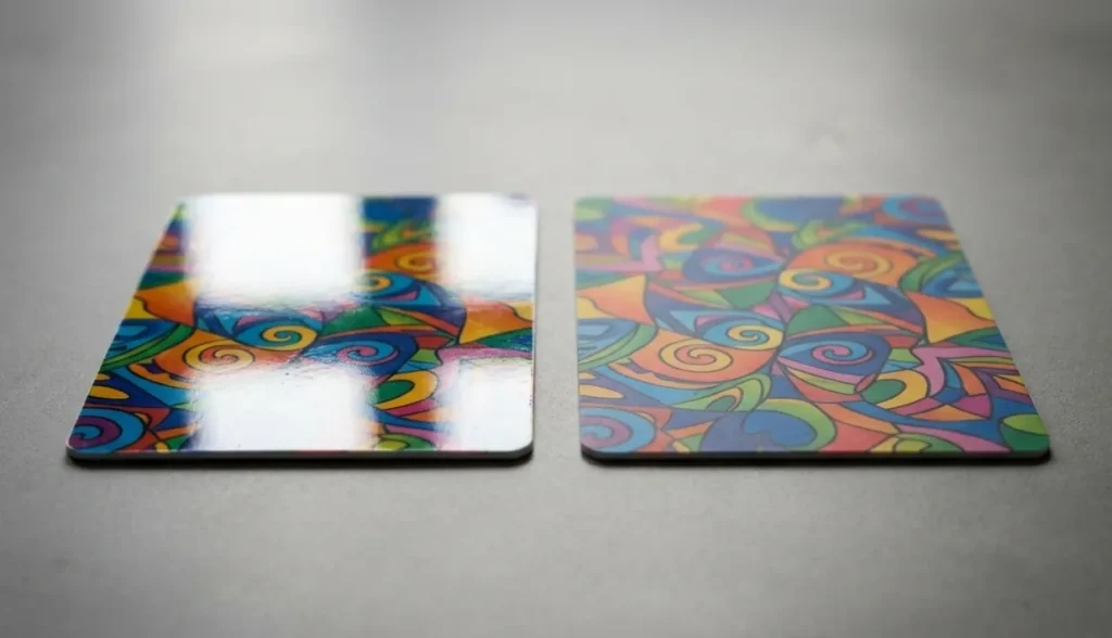
Matte & Frosted Finishes: The Diffuse Reflection Trap
When you apply the same ink to a matte or frosted finish, you are fundamentally changing the light path. These textured surfaces act as thousands of microscopic prisms, causing Diffuse Reflection.
•The Result: Light scatters in multiple directions, reducing the perceived contrast. This causes the color to appear “muted” or “softer” compared to glossy finishes, often leading to customer complaints about the color looking “too dark” or “washed out” despite the ink formula being correct.
Transparent Substrates: The Absence of an Optical Floor
Transparent cards introduce a high-risk variable: the lack of an Optical Floor.
•The Failure Mechanism: Without a high-density White Base layer, the ink becomes semi-transparent. The final appearance is no longer determined by the ink itself, but by the environment behind the card.
•Factory Insight: Light-colored brand identities (like pale yellows or soft cyans) are particularly vulnerable here, as background objects will bleed through the color field, causing unpredictable chromatic shifts.
Metallic & Tinted Bases: Chromatic Interference
Metallic or pre-colored base materials create the strongest Substrate Interference.
•The Physics: Since the substrate already possesses its own reflective or tinted signature, the printed ink acts as a semi-opaque filter rather than a solid cover. You are effectively “layering” colors, which alters the perceived result significantly.
•The Risk: A brand blue printed on a silver metallic base will inevitably shift toward a cooler, darker tone, requiring a complete recalibration of the ink formula to compensate for the base material’s interference.
The Factory Conclusion: Color consistency in RFID cards is not merely a printing challenge; it is a Material-Dependent Optical Problem. To achieve true consistency, we must manage how the surface reflects, absorbs, and transmits light—not just how the ink is applied.
4. Factory Insight: When Spot Color Becomes a Risk, Not a Benefit
While spot color is widely used to improve color consistency in RFID card production, it is not always a safe or universal solution.
In certain production scenarios, spot color can introduce additional risks if it is not properly matched with the material and finishing process.
Metallic Ink vs. Signal Interference
One common issue occurs when metallic inks are used. Although they can create premium visual effects, they may also interfere with RFID performance in some cases, especially for high-frequency applications such as 13.56MHz systems. Even minor changes in ink composition or coverage can affect signal stability when applied too close to embedded antennas.
Color Drift During High-Temp Lamination
Another risk appears during high-temperature lamination. RFID cards are typically laminated under heat and pressure, and some spot inks may shift slightly in density or tone after this process. This is not visible in small samples but becomes noticeable in large production batches.
The Transparent Card Failure
White ink and base layer control is another critical factor. Without proper white ink coverage, spot colors can lose opacity or appear uneven, particularly on transparent or dark-colored substrates.
In practice, spot color is not simply a “premium option.” It is a controlled process that requires coordination between ink formulation, material selection, and production parameters. Without this alignment, it can create unexpected inconsistencies instead of solving them.
5. Printing Method Is a Production Decision, Not a Cost Choice
In many RFID card projects, the choice between CMYK and spot color is often discussed purely from a cost perspective. However, in real manufacturing, this is not the most important factor.
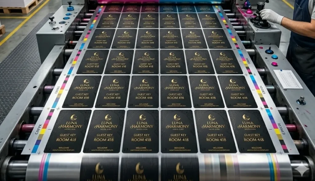
The actual decision should be based on production risk and color stability requirements.
•Ganged Run Printing: While it saves on plate fees, your color is influenced by other customers’ designs on the same sheet. If you seek brand consistency, Ganged Run is your biggest hidden risk.
•Dedicated Run Printing: Although initial costs are higher, it provides independent color control.
•The Logic of Reprint Costs: If 10,000 cards are rejected due to color deviation from a Ganged Run, the cost of reprinting and the delay in delivery will far outweigh the initial savings on plate fees.
6. Decision Framework: How to Choose the Right Card Printing Strategy?
To assist procurement and design teams, we have summarized the following decision matrix:
| Project Type | Recommended Method | Risk Level | Key Technical Requirement |
| Hotel Key Cards (High Volume) | Spot Color + Dedicated Run | Medium | Cross-batch consistency |
| Premium Membership Cards | Spot Color + UV Finish | Low | Pantone Matching ΔE < 1.5 |
| Event / Ticket Cards | CMYK Ganged Run | Low | Cost-efficiency priority |
| Transparent RFID Cards | Spot Color + Heavy White Base | High | Opacity vs. Light Balance |
| Metallic Texture RFID Cards | Color Recalibration + Antenna Avoidance | Very High | Signal penetration testing |
When NOT to Use Spot Color (Factory Honest Advice)
As a manufacturer, we recommend opting out of spot color in these scenarios:
•Ultra-Small Batches (<500 units): Mixing and cleaning costs make the unit price unreasonable.
•Extremely Short Lead Times: Spot colors require separate mixing and physical drying time, making “next-day delivery” impossible.
•Designs with Complex Gradients or Photos: Spot colors excel at flat tones, not at rendering intricate photographic details.
7. Real Production Experience: What 1,000+ RFID Card Projects Taught Us
Over the years, we’ve worked on a large number of RFID card projects across different industries, including hospitality, membership systems, and corporate access cards. One thing is consistent. Color issues almost never come from design alone. They usually appear during production scaling.
- Colors Most Prone to Disputes: Gray, Purple, and Brown. These are extremely sensitive to halftone dot changes and ink thickness.
- The Most Stable Material: Standard White PVC.
- The Top Cause of Rework: Customers using office inkjet printers to create “color standards” that are physically impossible to replicate on industrial PVC presses.
Conclusion: In Card Manufacturing, Color is a Production Constraint System
Color is more than a visual choice; it is a production constraint system involving materials, temperature, RF physics, and chemical formulations. Exceptional brand quality isn’t just “designed”—it is “manufactured” by rigorously locking down production variables.
If you are working on a RFID card project and need support in choosing the right color strategy, our production team can help evaluate your design before mass production to reduce risk and improve consistency.
FAQs
Q: Why does my Pantone color look different on PVC compared to paper color books?
Due to the non-porous nature of PVC and the refractive effect of the lamination overlay. We recommend referring to physical PVC samples provided by our factory.
Q: Is white ink mandatory for transparent RFID cards?
Yes. Without a white base, spot colors become translucent, making logos nearly invisible and potentially failing optical sensors in card readers.
Q: Does spot color significantly increase costs?
For high-volume orders, the added cost is marginal, but it reduces the risk of color-related rejections by 90%, making it the more economical choice in the long run.